
Columns and Rows
These layout widgets are fundamental to Flutter UI development and understanding their properties is crucial for creating responsive and well-structured interfaces.
Column
Section titled “Column”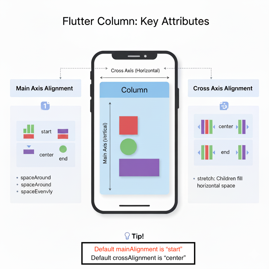
A Column is a widget that displays its children in a vertical array. It’s one of the most fundamental layout widgets in Flutter.
Most Used Attributes and Values
Section titled “Most Used Attributes and Values”| Attribute | Description | Common Values |
|---|---|---|
children | The widgets to display vertically | [Widget1, Widget2, ...] |
mainAxisAlignment | How children should be placed along the main axis (vertical) | MainAxisAlignment.start, center, end, spaceBetween, spaceAround, spaceEvenly |
crossAxisAlignment | How children should be placed along the cross axis (horizontal) | CrossAxisAlignment.start, center, end, stretch |
mainAxisSize | How much space should be occupied in the main axis | MainAxisSize.max, min |
verticalDirection | The order to lay children out vertically | VerticalDirection.down, up |
textDirection | The order to lay children out horizontally | TextDirection.ltr, rtl |
Example Usage
Section titled “Example Usage”Column( mainAxisAlignment: MainAxisAlignment.spaceBetween, crossAxisAlignment: CrossAxisAlignment.center, children: [ Container(width: 50, height: 50, color: Colors.red), Container(width: 50, height: 50, color: Colors.green), Container(width: 50, height: 50, color: Colors.blue), ],)Visual Representation with Diagrams
Section titled “Visual Representation with Diagrams”Column Layout Visualization
Section titled “Column Layout Visualization”flowchart TD
subgraph ColumnAlignment[Column Alignment Types]
direction TB
Start[MainAxisAlignment.start<br>Children at top] --> CenterAlign[MainAxisAlignment.center<br>Children centered] --> End[MainAxisAlignment.end<br>Children at bottom]
SpaceB[MainAxisAlignment.spaceBetween<br>Equal space between] --> SpaceA[MainAxisAlignment.spaceAround<br>Space around children] --> SpaceE[MainAxisAlignment.spaceEvenly<br>Equal space throughout]
end
flowchart TD
 subgraph ColumnLayout[Column - Vertical Arrangement]
        direction TB
        Parent[Parent Container] --> ColumnWidget[Column Widget]

        subgraph MainAxis[Main Axis - Vertical]
            direction TB
            Child1[Child 1] --> Child2[Child 2] --> Child3[Child 3]
        end

        subgraph CrossAxis[Cross Axis - Horizontal]
            direction LR
            Left[Start] --> Center[Center] --> Right[End]
        end

        ColumnWidget --> MainAxis
        ColumnWidget --> CrossAxis

    end
A Row is a widget that displays its children in a horizontal array. It works similarly to Column but along the horizontal axis.
Most Used Attributes and Values
Section titled “Most Used Attributes and Values”| Attribute | Description | Common Values |
|---|---|---|
children | The widgets to display horizontally | [Widget1, Widget2, ...] |
mainAxisAlignment | How children should be placed along the main axis (horizontal) | MainAxisAlignment.start, center, end, spaceBetween, spaceAround, spaceEvenly |
crossAxisAlignment | How children should be placed along the cross axis (vertical) | CrossAxisAlignment.start, center, end, stretch, baseline |
mainAxisSize | How much space should be occupied in the main axis | MainAxisSize.max, min |
verticalDirection | The order to lay children out vertically | VerticalDirection.down, up |
textDirection | The order to lay children out horizontally | TextDirection.ltr, rtl |
textBaseline | The baseline to use for aligning text | TextBaseline.alphabetic, ideographic |
Example Usage
Section titled “Example Usage”Row( mainAxisAlignment: MainAxisAlignment.spaceEvenly, crossAxisAlignment: CrossAxisAlignment.center, children: [ Container(width: 50, height: 50, color: Colors.red), Container(width: 50, height: 50, color: Colors.green), Container(width: 50, height: 50, color: Colors.blue), ],)Row Layout Visualization
Section titled “Row Layout Visualization”flowchart LR
subgraph RowLayout[Row - Horizontal Arrangement]
ParentR[Parent Container] --> RowWidget[Row Widget]
subgraph MainAxisR[Main Axis - Horizontal]
direction LR
ChildR1[Child 1] --> ChildR2[Child 2] --> ChildR3[Child 3]
end
subgraph CrossAxisR[Cross Axis - Vertical]
direction TB
Top[Start] --> Middle[Center] --> Bottom[End]
end
RowWidget --> MainAxisR
RowWidget --> CrossAxisR
end
subgraph RowAlignment[Row Alignment Types]
direction LR
StartR[MainAxisAlignment.start<br>Children at left] --> CenterAlignR[MainAxisAlignment.center<br>Children centered] --> EndR[MainAxisAlignment.end<br>Children at right]
SpaceBR[MainAxisAlignment.spaceBetween<br>Equal space between] --> SpaceAR[MainAxisAlignment.spaceAround<br>Space around children] --> SpaceER[MainAxisAlignment.spaceEvenly<br>Equal space throughout]
end
Practical Example Visualization
Section titled “Practical Example Visualization”flowchart TD
subgraph FlexProperties[Expanded Widget Properties]
Flex1[Expanded flex: 1<br>Takes 1/5 of space] --> Flex2[Expanded flex: 3<br>Takes 3/5 of space] --> Flex3[Expanded flex: 1<br>Takes 1/5 of space]
end
flowchart TD
    subgraph PracticalExample[Practical Column & Row Combination]
        direction TB

        MainColumn[Main Column] --> Header[Header Widget]
        MainColumn --> ContentRow[Content Row]
        MainColumn --> Footer[Footer Widget]

        subgraph ContentRowExpanded[Content Row Children]
            direction LR
            Sidebar[Sidebar Column<br>Expanded flex: 1] --> MainContent[Main Content Column<br>Expanded flex: 3] --> Ads[Ads Column<br>Expanded flex: 1]
        end

        ContentRow --> ContentRowExpanded
    end
Key Differences and When to Use
Section titled “Key Differences and When to Use”| Aspect | Column | Row |
|---|---|---|
| Primary Axis | Vertical (top to bottom) | Horizontal (left to right) |
| Use Case | Vertical lists, forms, stacked content | Horizontal lists, toolbars, tab bars |
| Scrolling | Use ListView instead for scrollable content | Use ListView with horizontal scroll |
| Common Children | Text, TextField, Button, Container | Icon, Text, Button, Spacer |
Advanced Usage with Expanded and Flexible
Section titled “Advanced Usage with Expanded and Flexible”Both Column and Row work well with Expanded and Flexible widgets to create flexible layouts:
Column( children: [ Expanded( flex: 2, // Takes 2/5 of available space child: Container(color: Colors.red), ), Expanded( flex: 3, // Takes 3/5 of available space child: Row( children: [ Flexible(child: Container(color: Colors.green)), Flexible(child: Container(color: Colors.blue)), ], ), ), ],)Common Pitfalls and Solutions
Section titled “Common Pitfalls and Solutions”- Overflow Errors: Use
Expanded,Flexible, orSingleChildScrollViewto handle content that might exceed available space - Alignment Issues: Remember that
crossAxisAlignmentworks perpendicular to the main axis - Size Constraints: Columns and Rows respect their parent’s constraints, so ensure proper constraint propagation